
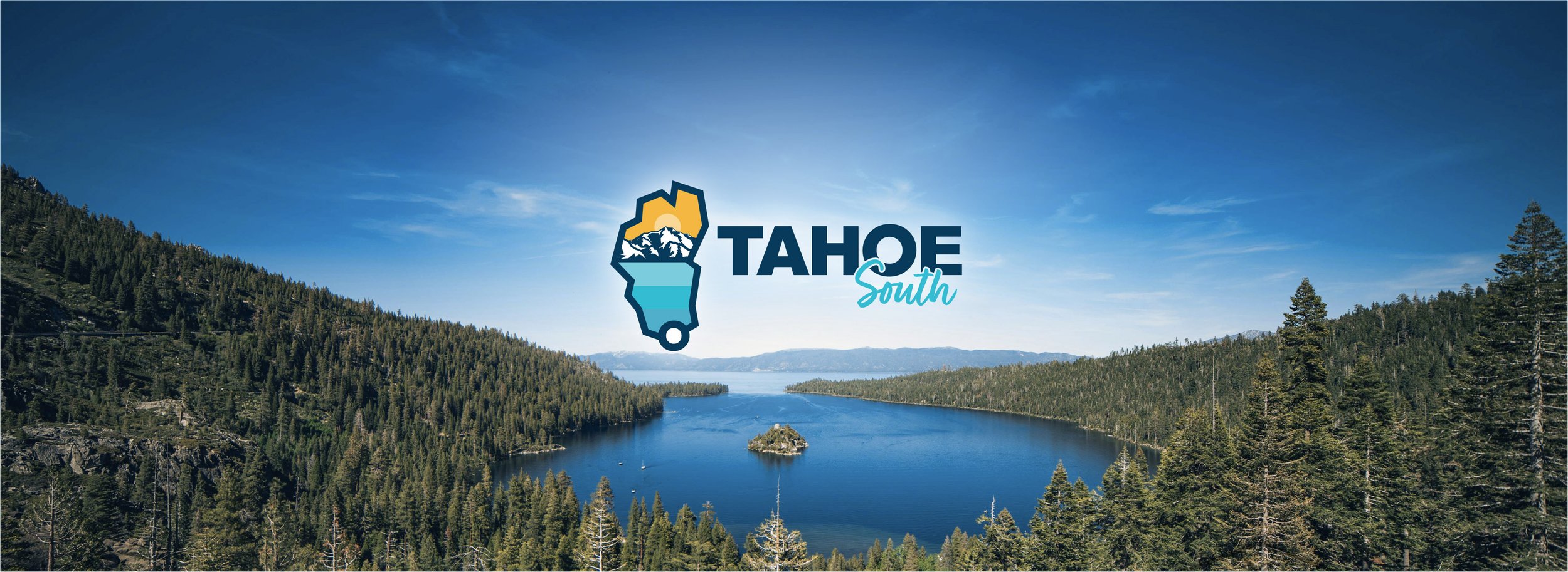
Tahoe South. Endless Adventures.
OBJECTIVE
For this project, I set out to redefine the visual identity of the City of South Lake Tahoe and co-branded Tahoe South as its tourism branch. My goal was to create a cohesive, stronger, and bolder brand system that captures both the city's natural beauty and its adventurous spirit.
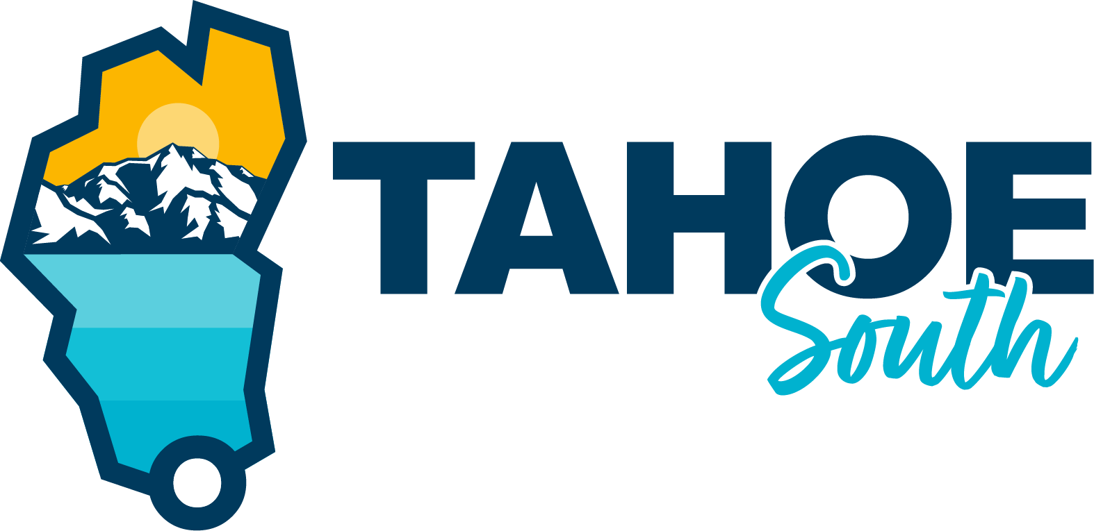
The rebrand for Tahoe South introduces a bold, vibrant aesthetic. While incorporating the lake’s shape from the city’s logo, I infused it with a fresh, energetic color palette that reflects the area's outdoor adventure scene—mountain trails, crystal-clear waters, and year-round excitement. The result is a dynamic brand system that balances sophistication with the thrill of exploration.
PROJECT SCOPE
Creative Direction
Brand Identity
Logo Design

BACKGROUND
Having a close relationship to Lake Tahoe, where some of my family lives, I always wonder why their logo and visual/ brand identity lacked the beauty and energy for which the city is known.
The old Tahoe South logo has an interesting, somewhat ornate typography that feels stylized and energetic. However, it doesn’t fully connect with the essence of South Lake Tahoe as a modern outdoor destination. It could represent almost any brand with a rustic, outdoorsy aesthetic rather than distinctly South Lake Tahoe.
Unlike the previous ornate typography, this version incorporates the shape of Lake Tahoe, immediately reinforcing a sense of place. The inclusion of mountains, a lake, and the sun captures the region’s natural beauty and adventure-driven appeal, while the bold, modern typography ensures clarity and versatility. The color palette, inspired by the lake’s deep blues, makes the logo feel organic yet contemporary. Overall, this rebrand is more effective because it tells a clearer story, making Tahoe South feel like a distinct and recognizable destination rather than just another outdoor brand.
Previous Logo
THE PROCESS
I started with some sketches using some of the elements already incorporated in the original designs, such as the mountains and the sun, as well as trying some new shapes and motions to reflect the dynamism of Lake Tahoe.
One of the initial sketches used a detailed outline of the lake, and within held the mountain elements similar to the ones seen on the original logo.

INSPIRATION
In order to revamp the brand identity for Tahoe South while keeping it in brand with the City of South Lake Tahoe, I decided to continue using the simplified, outside shape of the white incorporating nature elements in a similar style to the old CSLT logo. Again, I focused on the lake and the mountains but this time with a little bit of detail. At the same time, and in contrast with the CSLT color palette, the main color palette conveys nature and adventure.


Alpine Night
Lake Blue
Golden Sun
Hero Logo
Hero Logo Stacked

Logotype

Spring
Summer

Winter

Logomark


Spring

Summer

Winter


Lake
Beach
Snow
Activities Categories


Nighttime
Hiking & Nature
Events & Entertainment
Cycling & Off-Road


