Keep Tahoe Blue… but make it BOLD!
OBJECTIVE
For this project, I set out to redefine the visual identity of the City of South Lake Tahoe and co-branded Tahoe South as its tourism branch. My goal was to create a cohesive, stronger, and bolder brand system that captures both the city's natural beauty and its adventurous spirit.
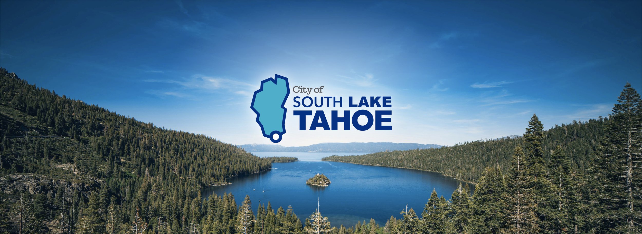
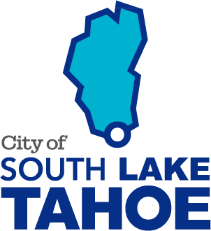
For the City of South Lake Tahoe, I embraced a minimalist approach, using the lake’s outline as the primary mark. A subtle circular indicator pinpoints the city’s location within the lake, creating a sleek and modern identity.
PROJECT SCOPE
Creative Direction
Brand Identity
Logo Design

BACKGROUND
Having a close relationship to Lake Tahoe, where some of my family lives, I always wonder why their logo and visual/ brand identity lacked the beauty and energy for which the city is known.
When looking at the current official logos, we notice a big disconnection between the city logo and the city official seal. Both were done not only in a different style but also in a style that now feels dated on both designs. Although the city logo has some good elements and a good color palette, the current designs lack the modern, dynamic aesthetic that reflects the city's breathtaking landscapes.
As for the seal, the simplistic outline of Lake Tahoe, bisected by a dashed line, feels more like a rough map than a compelling emblem of the city’s identity. The muted navy and yellow color scheme lacks the vibrancy and richness one would associate with the deep blues of the lake, the lush greens of the surrounding forests, or the crisp whites of the Sierra Nevada’s snow-capped peaks. Additionally, the decorative border and laurel elements feel generic rather than evocative of South Lake Tahoe’s unique charm as an outdoor recreation hub.
Previous Seal and Logo

THE PROCESS
I started with some sketches using some of the elements already incorporated in the original designs, such as the mountains and the sun, as well as trying some new shapes and motions to reflect the dynamism of Lake Tahoe.
One of the initial sketches used a detailed outline of the lake, and within held the mountain elements similar to the ones seen on the original logo.

INSPIRATION
Rather than reworking the elements of the original logo, I decided to simplify the overall shape and look of the logo, focusing on the lake and the mountains abstractly. I began the process by simplifying the outline of the logo, adding straight lines to make it more modern. At the same time, I wanted the main color palette to give a sense of tradition, safety, community, and welcoming.


Tradition
Lake
Mountains

Hero Logo
Hero Logo Stacked

Logotype
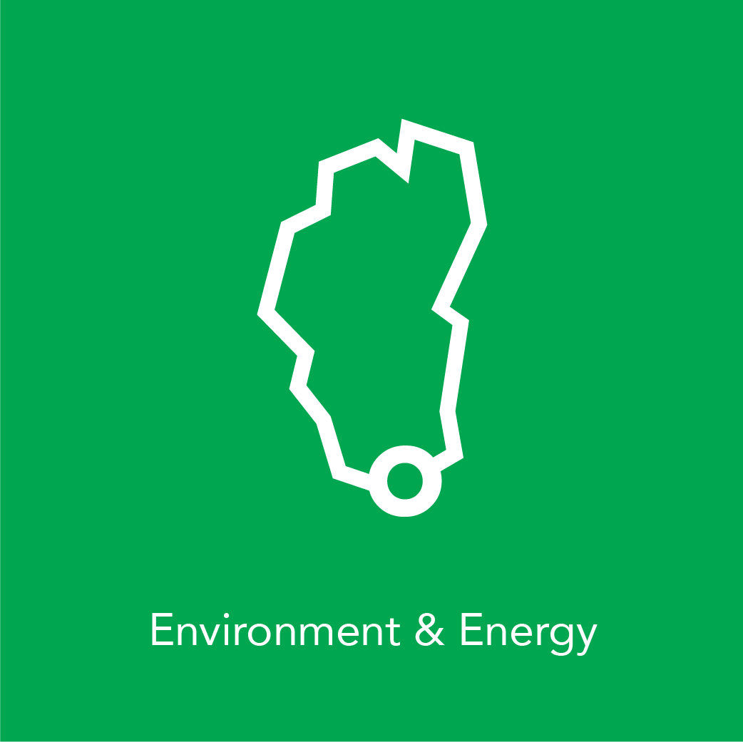
City Services Color Code
Logomark

City Seal